
Today, I sat down with the intention of designing a logo for myself. I needed one for my upcoming projects. I didn’t know where to start. So, I made the following list of things I wanted in the logo –
- My initials, MT
- Some sort of association with Taurus
I wanted to come up with a few ideas and got busy drawing. Here’re a few drafts –

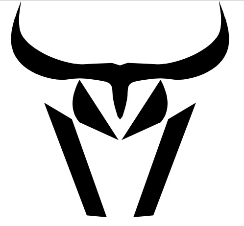
I wanted to use the eyes and the jawline of the bull as “M” and the horns and the upper part of the skull as the “T”. With that vision, I started working on more drafts.

I considered the following rules during my design process –
- It needs to be legible at 16×16
- It should be scalable (should be a vector graphic)
- It should handle monochrome and colors as well
The obvious tool of choice was Adobe Illustrator. I started working on converting my hand drawn drafts in to something more nicer. I came up with the following designs –

Although these expressed my vision, I wasn’t happy with the design. For starters, the combination of curves and sharp edges, felt a bit odd and disconnected. Also, these designs were not legible at 16×16. So, I started working on another design with the goal to have softer edges for the bull’s face and more curves to the bull’s horns. After 12 iterations, I was able to get to the design that I liked. Here it is –

The bull’s jawline along with the eyes make up the “M” and the horns with the top part of the skull make up the “T”. It took me roughly 10 hours from the idea inception to completion. Overall, I’m pretty satisfied with the outcome.
Comments